- ChatGPT
- Claude
- Figma
- JavaScript
- GSAP
- After Effects
- Photoshop
- Seedance 2.0
- Google Flow
- Kling
- Magnific
- Premiere Pro
- HTML5
- CSS
- Vercel
- Gemini / Veo
- Illustrator
- Antigravity
- Adobe Media Encoder
- HandBrake
- Splitting.js
- React Bits
- Next.js
- Google Analytics
- Microsoft Clarity
- Web Audio API
- HTML5 Canvas
- Supabase
Introduction
Don't start by building.
The temptation with any ambitious website is the same - open Figma, pick a style, start building. Skip that instinct for a second.
That is usually the wrong place to start. The more useful question is: what experience is worth building in the first place?
This project began with that question. The technology came later. The process moved from personal research and concept development into references, visual experiments, AI-generated imagery, video, relighting, design systems, AI-assisted development, testing and launch.
The interesting part is not the final website. It is how the idea was broken down into smaller problems that could actually be solved.
Concept first. Technology second.
Chapter 01
Find the idea.
A portfolio becomes more memorable when its experience comes from something genuinely personal instead of starting from a familiar template.
Before opening Figma, make a list of things that are genuinely connected to you. Interests. Habits. Places. Objects. Skills. Things you repeatedly return to. Things you could talk about without preparing a presentation.
A keyword cloud can be useful at this stage. The purpose is not to create a perfect list. It is to surface possibilities.
Don't make the site unique with decoration. Start with something that is already unique to you.
Deep dive Explore the process
In this project, the initial keyword exploration included design, motorcycles, adventure riding, collaboration, design thinking, prototyping, websites, mobile applications, exploration, love of design, love of exploring.
The important step was filtering. Generic portfolio words were removed. The ideas that had a real connection to the person remained. Motorcycles, riding and exploration became a strong direction.
Why filter?
A keyword cloud is only useful if it leads somewhere. Don't try to include every interest in the final experience. Look for the few ideas that can support:
- A visual language
- A story
- An interaction
- A behaviour
- A reason for the user to continue
The original keyword cloud is no longer available. Reconstructing an exact list from memory would misrepresent what actually happened. What matters is the filter, not the words.
Chapter 02
Give the idea a story.
An unusual visual idea becomes stronger when there is a reason behind it.
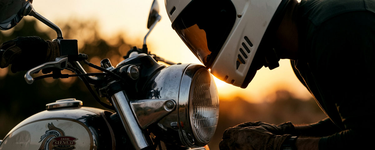
A motorcycle could simply be a visual theme. It becomes more meaningful when it represents movement, exploration and a way of seeing the world.
The useful question is: what does this idea allow the user to experience?
Don't stop at "this looks cool." Ask what the concept lets the user do or feel.
Deep dive First explorations
In this project, the motorcycle became a vehicle for moving through different places and experiences.
It wasn't the first idea. Before this, I explored an astronaut leaving a spacecraft and drifting through different planets, a whole cosmos to move through. I also explored a more traditional route: a well-crafted GSAP-animated site with normal scroll-through content.
Both had something. Neither felt like me. Both got discarded, and the motorcycle POV became the direction.
Chapter 03
Write the voice before the words.
The interface needed a personality before it needed any copy.
Voice was decided before a single line was written.
The ride is a personal experience, so the language couldn't sound like a portfolio template. Before writing headlines, buttons or chat messages, I defined how the site should speak. The voice had to feel like a person talking to another person, not a brand talking to an audience.
That decision mattered because AI can produce perfectly acceptable copy very quickly. It can also make everything sound the same. Without a clear voice to work against, every line could slowly drift towards polished, generic portfolio language.
The voice canon became the filter. Every piece of content had to pass through it.
The rules that filter every line.
Words to use
- road
- ride
- rider
- work
- brand
- hands
- line
- place
- terrain
- night
- dusk
- horizon
- gear
Words not to use
- solutions
- leverage
- elevate
- journey as a verb
- empower
- holistic
- seamless
- stakeholder
- deliverable
- ecosystem
These rules weren't there to make every line identical. They were there to make sure every line felt like it belonged to the same person.
Use AI as a first-draft partner, not a writer.
AI was useful here, but only when given boundaries.
The workflow was simple. Give it the voice canon and the context. Ask for three to five versions. Then start cutting. The first draft is rarely the final line. Often the useful part is buried somewhere inside it.
AI is good at generating possibilities, changing tone, finding variations and getting past the blank page. It is much less reliable at knowing when a sentence feels too polished, too clever or simply not human enough.
So the final pass was always human. Cut the explanation. Remove the unnecessary word. Keep the pause. Sometimes the best version is only a fragment.
Before
"Welcome to my portfolio. Explore my work and discover how I approach brand and experience design."
After
"I've got an extra helmet. Coming along?"
The second line doesn't explain the portfolio. It doesn't need to. It gives the visitor a role, establishes the world and starts a conversation.
Microcopy carries the personality.
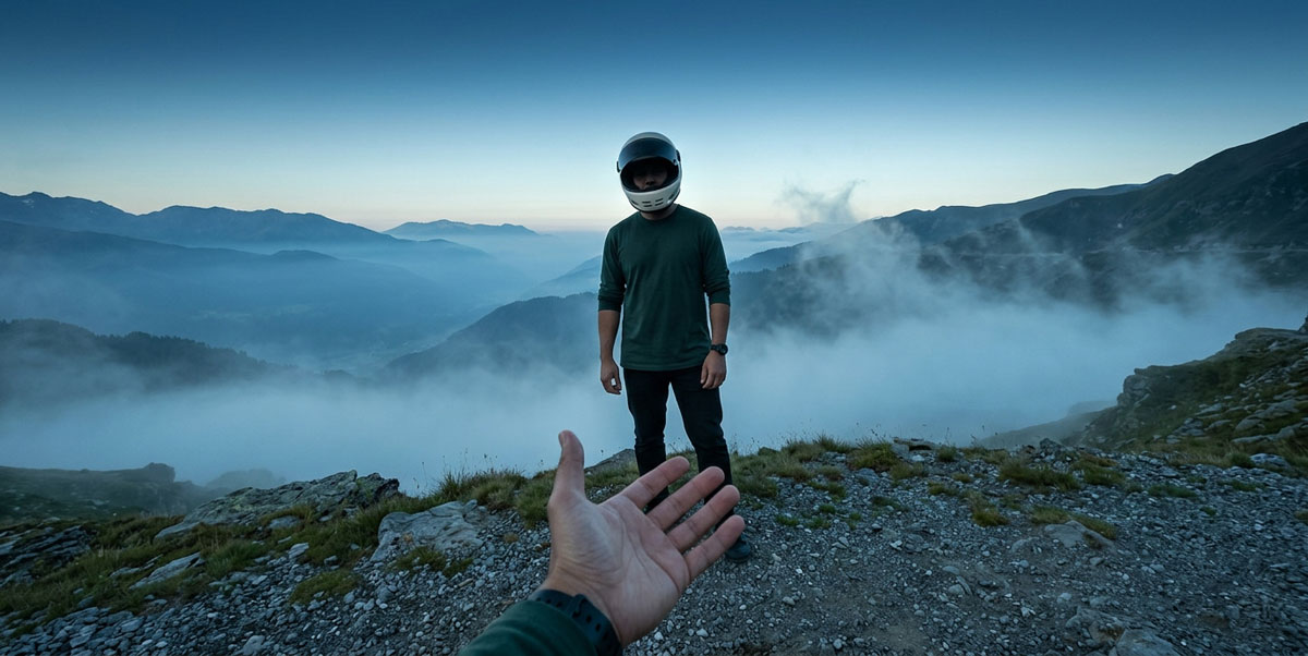
The biggest lines get attention. The smallest ones make the experience feel human.
Navigation is kept to one or two words. Buttons stay at two or three. Chat speaks in the first person. Empty states don't apologise for being empty. Every small interaction gets the same care as a headline.
"More" is enough for the menu. "I'm in" is enough to start the ride. "Scroll to start." is enough to explain what happens next.
And then there's:
"I've got an extra helmet. Coming along?"
It's a tiny sentence, but it does more work than a conventional hero headline ever could. It introduces the person behind the site, establishes the motorcycle world, invites the visitor to participate and sets the tone for everything that follows.
The content wasn't added after the design. It was part of the design.
Chapter 04
Explore before committing.
The first visual direction is rarely the final one.
The early exploration moved through game-like 3D environments, vector illustration, different illustration styles, different visual treatments and realistic imagery.
Illustration was deliberately questioned because it is already widely used. The experience was meant to communicate real-world scenarios, not just represent them with a decorative style. That led to a more important question: if the user is experiencing things that have actually been experienced in real life, what would happen if the user saw the world from the rider's point of view?
Exploration is not wasted work. It helps reveal what the final direction should not be.
Chapter 05
Make the user see the experience.
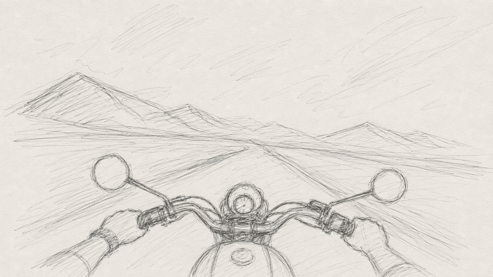
The POV was born from a simple question: when I'm riding the bike, what am I seeing?
That changed the role of the visitor. Instead of watching a designer's story from the outside, the visitor could see the world from the rider's position.
This is where realism became useful. The goal was not photorealism as a look. The goal was to make the experience feel like a real-world point of view. The rider's face did not need to be shown. The viewer could experience the ride through the rider's eyes.
When the story is about experience, consider showing the experience instead of explaining it.
Chapter 06
Build a reference system.
AI becomes much more useful when it has a consistent visual source of truth.
Instead of repeatedly describing a person, vehicle and helmet from scratch, build references first. Here the reference set was rider, motorcycle, helmet - personally photographed and turned into character sheets.
The important idea is to separate what must stay fixed from what can change.
Fixed
- Rider
- Motorcycle
- Helmet
- POV
- Camera angle
- Established framing
Variable
- Location
- Environment
- Weather
- Lighting
- Atmosphere
- Landscape
When AI needs consistency, give it a visual source of truth before asking it to generate variations.
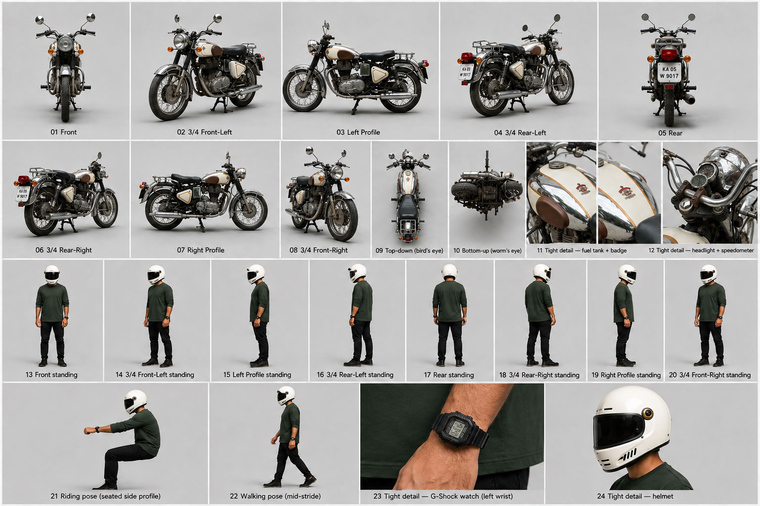
Deep dive Why three sheets?
Each element has to remain consistent across multiple generations. The reference sheets provide shape, proportion, clothing, materials, details, position and visual identity.
A character sheet is what animation studios use to keep a character looking the same across a whole film. Feeding one to an image model means the model can generate the character in new situations without losing what makes it that character.
Chapter 07
Find the first good image.
The goal of the first image experiment was not to create the final scene. It was to find the right POV.
Different AI tools were used to explore different interpretations of the rider's perspective. One generated image finally matched the visual direction that was already forming in the mind. That became the base.
The important decision was knowing when to stop exploring completely different directions. Once the visual language felt right, further exploration could happen inside that language instead of restarting from zero.
Reference sheets → POV experiments → Compare outputs → Choose the strongest direction → Use it as the base
Exploration should eventually converge. Once the right visual language appears, build a system around it.
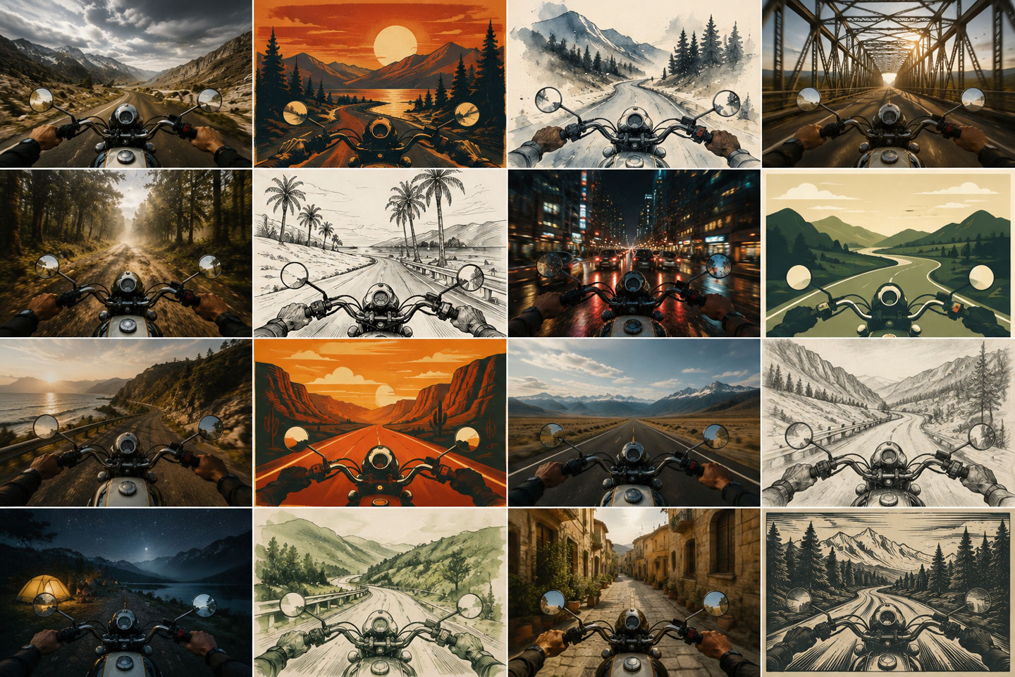
Chapter 08
Turn one image into a system.
Generating one good image is very different from generating many consistent images.
The next challenge was creating different places without losing the established rider, motorcycle, helmet and POV. A dedicated Image Prompt Engine was created in Claude. Its job was to translate the visual reference into words and keep the important characteristics consistent.
The engine understood rider, motorcycle, helmet, POV, camera angle, framing and visual characteristics. It also accepted new location imagery as reference, then generated structured prompts for new scenes.
The useful AI workflow is not "generate again." It is "build a repeatable instruction system."
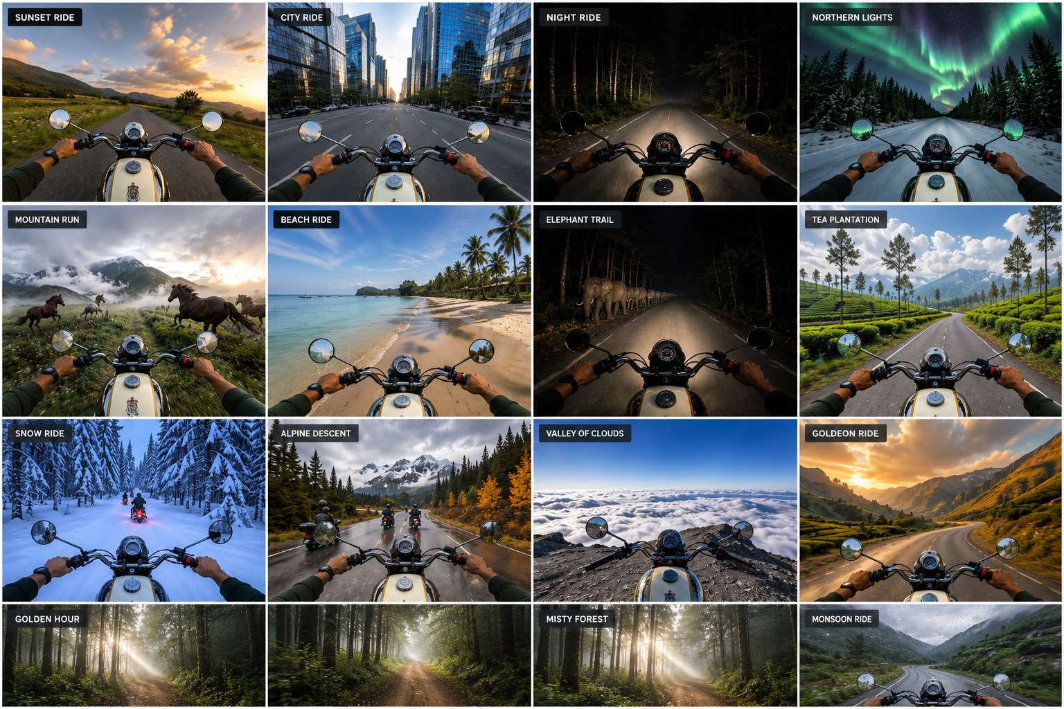
Deep dive The workflow
Reference images → Image Prompt Engine → Structured prompt → ChatGPT → Generated image → Review → Iterate
Tools

Prompt structure
 ChatGPT
Image generation
Chapter 09
The image prompt.
Detailed image prompts work best when they describe the parts of the image that must remain controlled.
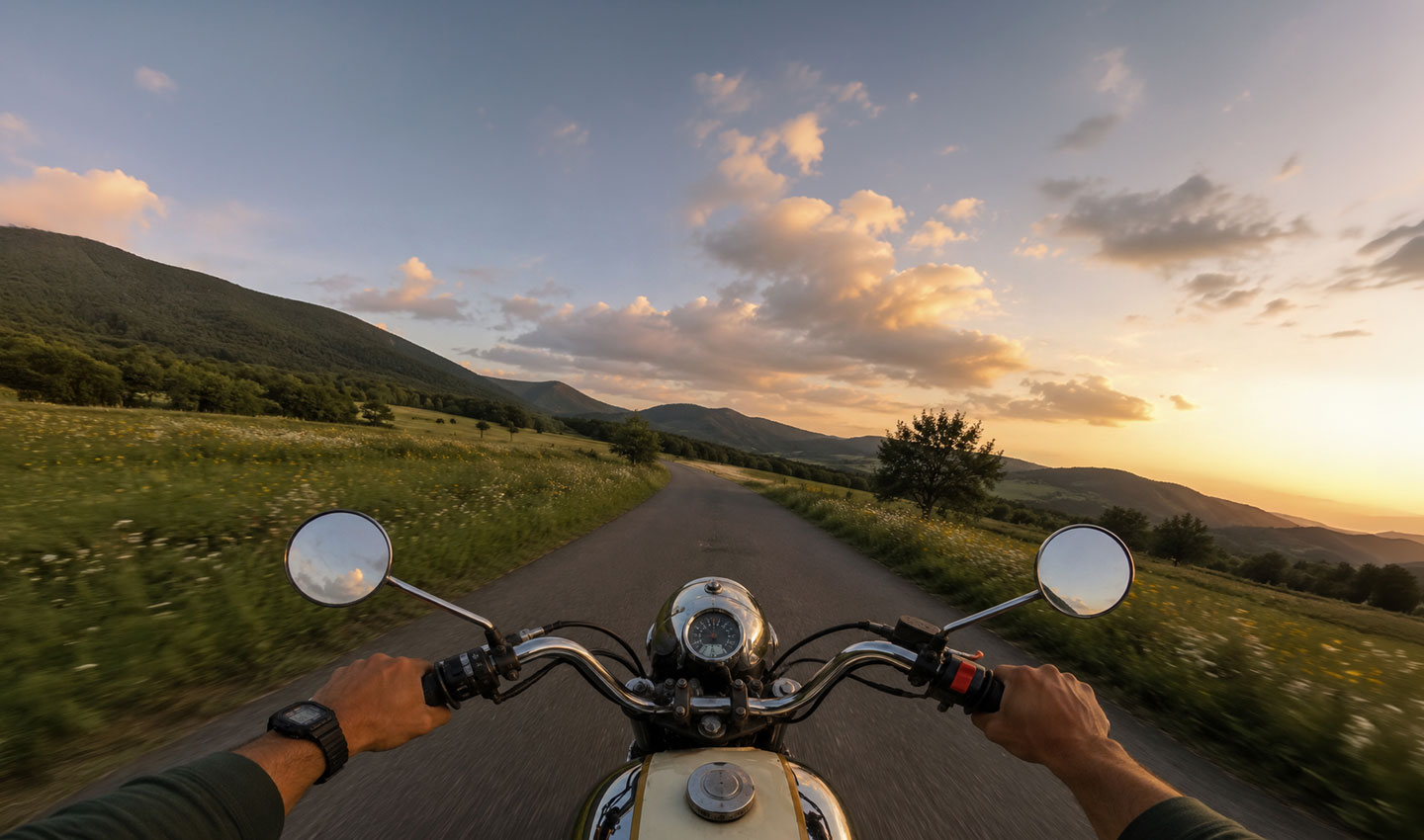
A useful prompt can be structured around reference inputs, camera, foreground, environment, lighting, composition, palette, style and negative constraints. The prompt below is a real example from the project.
Deep dive Explore the process
Notice how much of the prompt is dedicated to what should stay constant across every generation - the fuel tank, the handlebars, the watch on the left wrist, the exact framing. Only the environment section describes the specific scene.
Real prompt View the actual prompt
Real prompt · GoPro mountain valley
The actual prompt used with the three reference images loaded (rider sheet, motorcycle sheet, mountain valley reference). No edits.
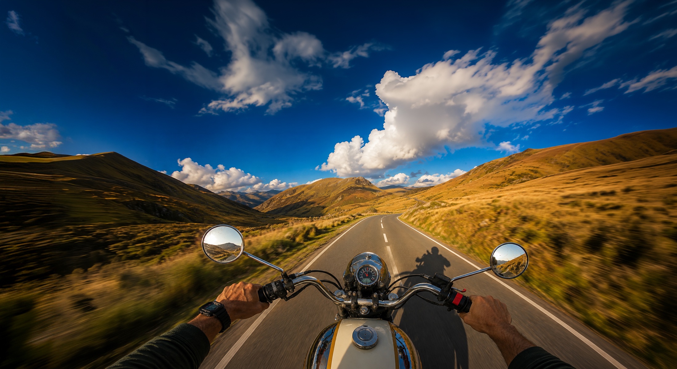
Using the three uploaded references - motorcycle sheet, rider sheet, and the mountain valley reference (for lighting, palette, and mood) - generate one photorealistic wide-angle photograph (16:9 landscape, high resolution) taken from a GoPro-style action camera mounted on top of the rider's helmet, pointing forward while riding.

Foreground - identical framing (keep constant):
Upper half of the chrome-and-cream fuel tank with gold pinstriping in lower-center. Full chrome handlebar spanning the lower third. Both bare hands gripping the handlebars, deep forest green rolled-up sleeves visible on both wrists, black Casio G-Shock on left wrist. Top of the chrome headlight nacelle and round analog speedometer visible above the tank. Round chrome rear-view mirrors on either side. Slight barrel distortion (16mm equivalent). Chrome brilliantly catching warm afternoon light.

Environment - open highland mountain valley matching the reference:
A narrow winding single-lane asphalt road with white centre line, snaking through a wide sweeping valley between two big rolling grassy mountain ridges. The road curves gently ahead, bending gracefully into the distance. Golden-yellow autumn grasslands blanketing the sloping hills on both sides, with patches of green and dry brown, occasional exposed rocky outcrops, sparse low shrubs. Distant peaks rising on both sides of the valley, layered ridges receding into hazy blue-grey depth.

The shadow - the hero detail:
Strong dramatic backlighting from the low afternoon sun positioned behind and slightly to the right of the rider (out of frame), casting a crisp sharp shadow of the rider and motorcycle projected forward onto the road ahead. The shadow is clearly readable - you can see the silhouette of the rider's helmeted head, shoulders, arms on the handlebars, and the full outline of the bike with round front wheel and handlebar shape - stretched slightly by the low sun angle and falling across the tarmac just ahead of the front wheel and to the right side of the lane. The shadow adds cinematic depth and rhythm to the composition.

Sky:
Bright vivid saturated blue sky exactly matching the reference - clean deep cobalt blue with dramatic layered white cumulus clouds catching warm golden edge-light, some puffy clouds building up over the peaks, subtle golden hour undertones. High contrast, alive, cinematic.

Lighting:
Warm strong late-afternoon light coming from behind-right - golden rim light glowing on the tops of the handlebars, mirrors, headlight nacelle, fuel tank, and the rider's hands and forearms. Deep contrasty shadows on the shaded side of the bike. Long soft grass on the hills catching warm golden highlights. Rich luminous atmosphere. Warm honey light on the road surface where it isn't shadowed.

Mirrors: reflect the sunlit valley behind, blue sky and warm golden grass hills, hints of glare from the low sun.

Palette: deep saturated cobalt blue sky, brilliant white cloud highlights, warm golden-yellow grassland, dark brown-grey road, deep charcoal shadow of the rider on the road, warm cream on the tank, brilliant chrome reflections, warm skin tones on hands.

Style: photorealistic real GoPro action-camera photograph, cinematic depth-of-field with sharp handlebars and sharp shadow, gentle motion blur on the road edges suggesting forward speed, natural film grain, vivid alive afternoon mountain riding mood, high dynamic range between bright sun-hit surfaces and deep crisp shadows.

No text of any kind anywhere in the image - no brand names, no logos on the tank or handlebars, no video play buttons, no timestamps. Ignore any text or UI in the reference video screenshot.
Chapter 10
Move from image to video.
Not every generated image needs to become a video.
Video generation takes more time and costs more, so the possible scenes were filtered down to five main scenarios before production moved forward.
The lesson is simple. Explore broadly with lower-cost assets first. Spend the expensive production effort only on the scenes that matter most to the experience.
Image exploration → Review possible scenes → Select the key five → Move only those into video production
Filter before you animate.
Chapter 11
Define motion before generating video.
A still image can tolerate ambiguity. A video cannot.
Before generating video, define exactly what should move, what should remain stable and how the movement should behave at the end.
Important constraints in this project:
- Motorcycle never stops
- Motorcycle never slows down
- Constant cruising speed
- Smooth left/right sway
- Continuous forward motion
- Loopable ending
- First and last composition match
- Foreground motion continues through the final second
- Distant elements remain comparatively stable
- Environmental motion stays consistent
The video prompt went through multiple iterations before reaching the final version.
For AI video, describe motion as carefully as you describe the image.
Chapter 12
The final video prompt.
The final prompt that worked. Not the failed ones.
Deep dive Explore the process
Video models are literal. If the prompt hints at slowing down at all, the model will slow down. So the final prompt is a series of very direct instructions, sometimes repeated in different wording. The caps-locked repeat section at the bottom is not decoration - it is what makes the loop hold.
Real prompt View the final video prompt
Real prompt · Coconut palm forest loop
Preserved verbatim, including the caps-locked repeat rules at the end. The model needs them.
CRITICAL - READ CAREFULLY:

The motorcycle MUST NEVER STOP. Not at the beginning, not in the middle, not at the end. The bike is riding continuously the entire time and is STILL RIDING at full cruising speed at the very last frame - as if the video simply cuts away while the bike keeps going. The last frame is NOT a destination. The last frame is NOT an arrival. The bike does NOT come to rest. The bike does NOT slow down before the last frame. The bike does NOT stop.

The last frame just happens to be composed identically to the first frame because it is a seamless loop - but the bike is moving at full cruising speed in BOTH the first frame and the last frame.

Seamless looping handlebar POV of a motorcycle riding down a narrow dirt trail through a misty tropical coconut palm forest at early morning, sunlight breaking through the canopy in soft god rays, 8 seconds, photorealistic, cinematic, one continuous take, constant cruising speed the entire time.

Motion:
Bike cruises forward at a steady pace from frame 1 to the final frame without any change in speed. The dirt trail and lush tropical undergrowth flow past with consistent motion blur - trail streaming by at the exact same speed the whole time, INCLUDING in the final second.

The bike moves LEFT AND RIGHT very smoothly and subtly - soft lean to the left, then straighten, soft lean to the right, then straighten, then returns to the exact starting composition by the final frame. The handlebars tilt gently with each lean, the fuel tank framing shifts naturally with the bike's motion. Buttery smooth cinematic sway, no jerks, no snaps.

Tall coconut palm trees line both sides of the trail - trees closer to the bike blur past with soft motion blur as the bike moves forward, while the distant misty tree line and canopy stay steady. Lush green banana leaves and tropical undergrowth on both sides sway gently in the humid morning air. Soft warm sunlight breaks through the canopy from the upper left as visible god rays cutting through the mist, illuminating drifting fog and dust particles in the air. The god rays flicker gently as the bike moves past the palm trunks, but their overall position stays consistent throughout the loop.

Rider's hands steady on the chrome handlebars with tiny natural adjustments as the bike leans left and right.

Cinematic feel:
Buttery smooth camera, gentle bike lean into the left-right sway, subtle handlebar tilt, humid tropical atmosphere, drifting mist, warm morning god rays through the canopy. Soft diffused tropical morning light consistent throughout. Film grain, shallow depth of field on the handlebars, sharp focus on the trail and palms ahead.

REPEAT - MOST IMPORTANT RULES:

- BIKE IS MOVING AT FULL SPEED AT FRAME 1.
- BIKE IS STILL MOVING AT FULL SPEED AT THE LAST FRAME.
- BIKE NEVER STOPS. BIKE NEVER SLOWS DOWN. BIKE NEVER DECELERATES.
- BIKE SWAYS SMOOTHLY LEFT AND RIGHT THROUGHOUT - SOFT LEAN LEFT, STRAIGHTEN, SOFT LEAN RIGHT, STRAIGHTEN, RETURN TO START.
- ONLY THE TRAIL AND NEARBY PALMS/UNDERGROWTH MOVE PAST - DISTANT MISTY CANOPY AND GOD RAYS STAY CONSISTENT IN THE FRAME.
- MOTION BLUR ON THE TRAIL AND FOREGROUND STAYS IDENTICAL INTENSITY FROM START TO FINISH - INCLUDING IN THE FINAL SECOND.
- FIRST FRAME = LAST FRAME (framing only). SEAMLESS LOOP.
- LAST FRAME IS JUST ANOTHER MID-RIDE MOMENT, NOT AN ARRIVAL.
Chapter 13
Build a day/night system.
Once the design supported light and dark themes, the visual system suggested a natural extension. Light = day. Dark = night.
Instead of creating a completely different night scene, preserve the same scene and change only the treatment. This makes the day/night switch feel like one continuous composition rather than two unrelated pieces of content.
The goal was to preserve composition, rider, motorcycle, camera, motion, scene structure and sequence. Only the lighting, colour and weather treatment should change.
When two visual modes need to feel connected, preserve structure and change treatment.
Chapter 14
Build a relighting engine.
Relighting needed a different kind of prompt.
The prompt should not describe a new composition. It should tell the model what must remain untouched, what is allowed to change, how the new lighting should behave and how the weather should be introduced.
A dedicated Relighting Engine was created in Claude. Its responsibility: generate prompts that focus on lighting, colour and weather while explicitly protecting the original structure.
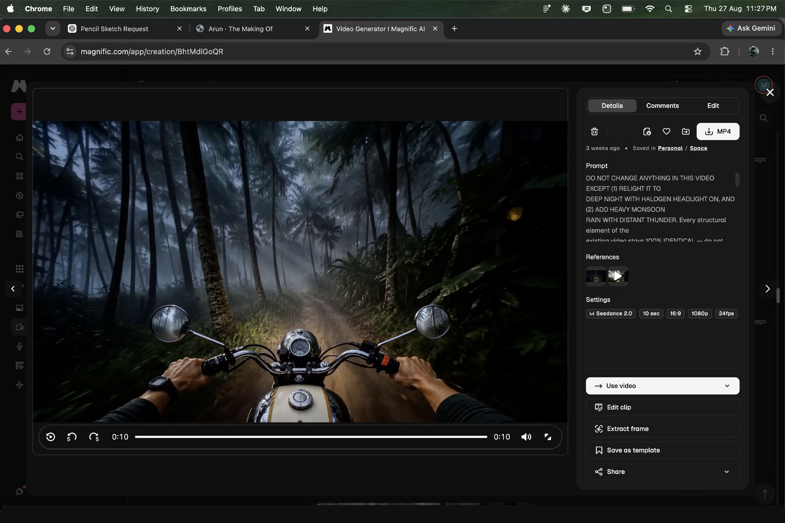
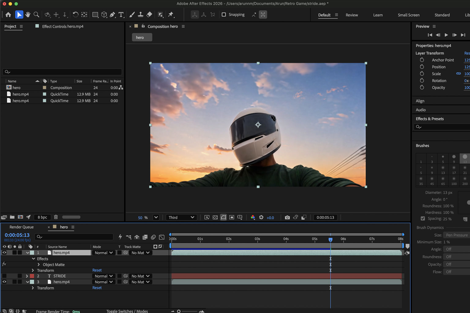
Day video → Relighting Engine → Relighting prompt → Magnific → Seedance 2.0 → Night video → After Effects → Final lighting adjustment
After Effects was used to adjust brightness, levels and overall lighting. The purpose was to make the final night treatment darker and more realistic.
When transforming an existing asset, explicitly define what is allowed to change and what must stay fixed.
Chapter 15
The final relighting prompt.
Notice how much of this prompt is "don't touch." That is the whole point of a relighting engine.
Deep dive Explore the process
The prompt below is a real example. It defines the two allowed changes upfront (relight + monsoon rain), specifies exactly what stays identical, then details the desired lighting, weather and atmosphere.
Real prompt View the final relighting prompt
Real prompt · Deep-night monsoon relight
Preserved verbatim.
DO NOT CHANGE ANYTHING IN THIS VIDEO EXCEPT (1) RELIGHT IT TO DEEP NIGHT WITH HALOGEN HEADLIGHT ON, AND (2) ADD HEAVY MONSOON RAIN WITH DISTANT THUNDER. Every structural element of the existing video stays 100% IDENTICAL - do not touch the handlebar framing, hand positions, camera motion, bike sway, palm tree positions, dirt trail path, or any composition. Only the time of day, lighting, and weather change.

Night version of a handlebar POV motorcycle ride down a narrow dirt trail through a misty tropical coconut palm forest during a heavy monsoon rainstorm at midnight, photorealistic, cinematic midnight monsoon, seamless loop, constant cruising speed the entire time.

Lighting changes ONLY:
- The entire scene becomes very dark, deep midnight - heavy black shadows, minimal ambient light, almost pitch-black overall mood.
- Sky through the canopy becomes very dark navy-black, faintly lit by distant lightning flashes now and then.
- Tall coconut palm trees on both sides become deep dark silhouettes with faint moonlight rims on the wet leaves.
- Lush undergrowth and banana leaves become dark and cool-toned, wet and glistening, only visible where the headlight touches them.
- The dirt trail becomes dark and wet, muddy with puddles reflecting the headlight glow, illuminated only where the headlight cone falls.
- The motorcycle's HALOGEN HEADLIGHT is ON - a natural warm yellow-white beam (classic old motorcycle halogen light, slightly amber, warm color temperature around 3000K) projecting forward from the bike, spilling out in a soft cone shape. The beam illuminates the muddy trail ahead in a warm glow, catches the nearest palm trunks and dripping leaves in warm amber, and fades quickly into darkness at the edges.
- Chrome handlebars, mirrors, fuel tank, and speedometer catch soft warm reflections from the headlight glow and the dashboard's own faint warm light, all wet with rain.
- The rider's hands and green long-sleeve are dimly lit, wet from rain, with subtle warm bounce from the dashboard.
- DISTANT LIGHTNING flashes occasionally somewhere off-frame, briefly illuminating the whole canopy in a soft cool blue-white wash for a split second, then returning to deep darkness. Lightning flashes are subtle and infrequent, not every second - cinematic, atmospheric.

HEAVY MONSOON RAIN - ADD REALISTICALLY:
- Rain falls heavily from above throughout the entire video - a proper thick monsoon downpour, not a drizzle.
- Because the motorcycle is moving forward, the raindrops STREAK TOWARD THE CAMERA at a diagonal angle - flying past the viewer's face from far to near, some passing directly by the camera lens. Classic POV "riding into a rainstorm" feel.
- DEPTH OF FIELD MUST BE REALISTIC:
  - Raindrops very close to the camera are LARGE, SOFT, HEAVILY MOTION-BLURRED streaks flying past, some out of focus.
  - Raindrops in the middle distance are sharper streaks clearly visible cutting through the air.
  - Raindrops far away are tiny fine streaks densely filling the background as a sheet of rain.
- RAIN INSIDE THE HEADLIGHT BEAM MUST GLOW - every raindrop caught in the warm halogen headlight cone lights up brightly in warm amber-white, becoming clearly visible as bright streaks against the dark forest. The headlight beam becomes a visible cone of illuminated falling rain - dramatic, cinematic.
- Raindrops outside the headlight cone are faint cool-white streaks, barely visible against the dark forest.
- Rain hits the muddy trail, palm leaves, and dripping undergrowth - puddles ripple, water splashes off the leaves, mist rises from the ground.
- Water streams down the chrome handlebars, mirrors, fuel tank, and rider's arms, catching the headlight glow as tiny warm highlights.
- Faint mist and rain haze fill the air, softening distant palm trunks and adding atmospheric depth.

DISTANT THUNDER:
- Deep rumbling thunder rolls in the distance every few seconds - not directly overhead, off in the distance. Adds ambient depth to the monsoon feel.

Everything else stays IDENTICAL to the original video:
- Same handlebar position, same fuel tank, same mirrors, same speedometer, same watch on the left wrist.
- Same rider hand positions and green long-sleeve.
- Same bike left-right sway motion, same cruising speed, same motion blur intensity on the trail and palms.
- Same palm tree positions, same trail curvature, same overall composition and framing.
- Same seamless loop - first frame = last frame.

CRITICAL:
- This is a RELIGHT + ADD RAIN + ADD THUNDER, not a new composition. Do not touch the palm trees. Do not touch the trail path. Do not touch the camera motion. Do not touch the bike sway.
- The bike is NOT a separate layer on a black background - the entire scene is naturally lit as a real midnight monsoon ride with a halogen headlight cutting through the rain.
- Overall look must be DEEP DARK NIGHT MONSOON - around midnight, heavy rain, occasional distant lightning, atmospheric.
- Headlight is warm halogen (amber-yellow, ~3000K), classic old motorcycle look - NOT modern white LED.
- Raindrops inside the headlight cone must GLOW brightly amber-white - the dramatic centerpiece of the visual.
- Bike never stops, never slows, constant cruising speed.
- Seamless loop, first frame identical to last frame.
Result
Chapter 16
Design the system before the pages.
When AI is going to build multiple pages, consistency has to be established before the implementation spreads.
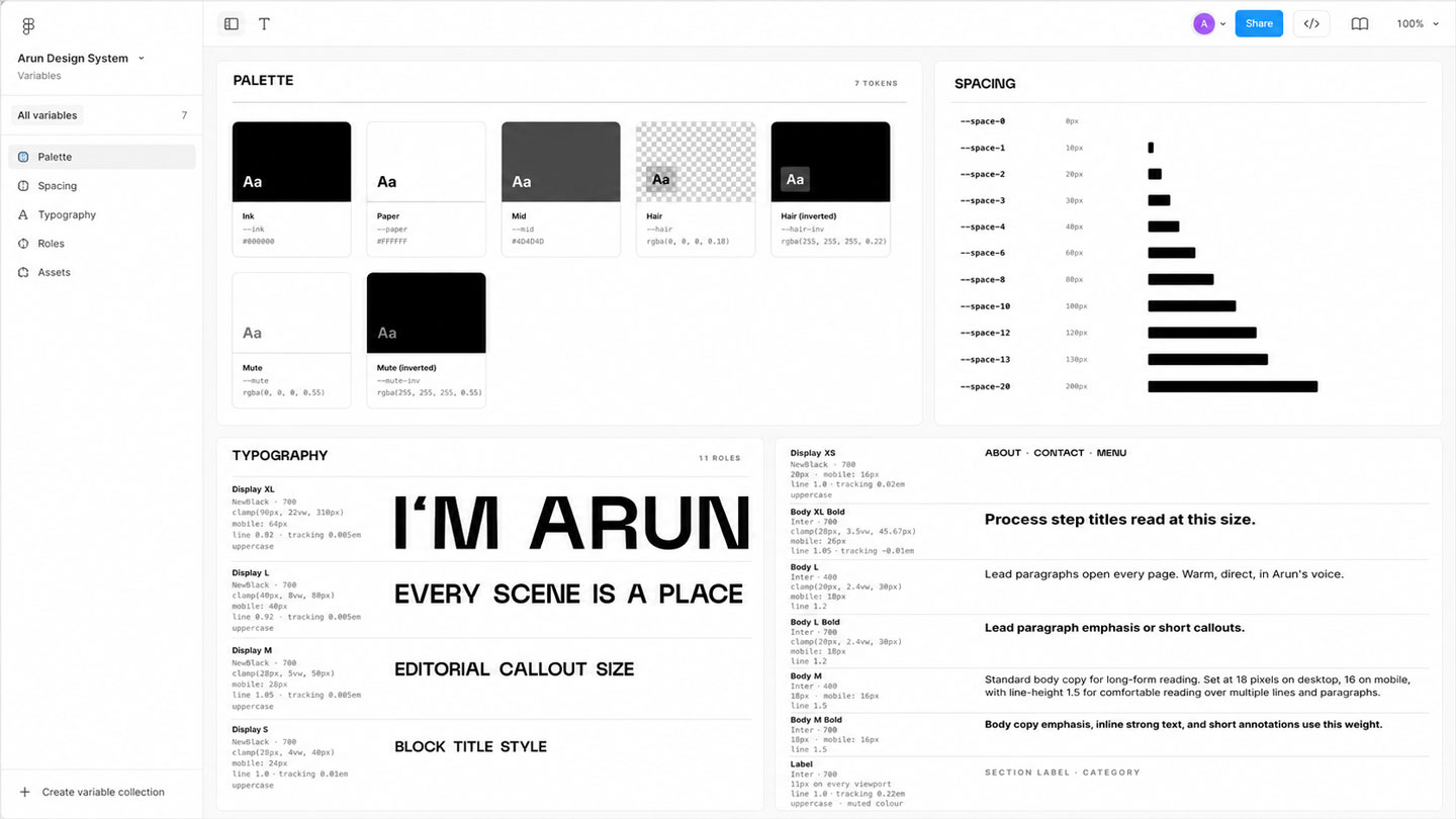
The design system was built in Figma using typography, spacing, padding, variables, styles, reusable UI values, icons and responsive rules. Figma became the visual source of truth.
Figma Cloud MCP was used to make the design system available to AI. The UI kit was then translated into a development-ready system so the same values could be used across the project.
Give AI a system, not a collection of screenshots.
Chapter 17
Design page by page.
The entire website was not designed in one giant pass. Design and development happened page by page.
Homepage → Game → About → Chat → Tutorial
The homepage established the menu, footer, logo, background media, core layout, main interaction and mobile version. Then the next page was designed and converted. The same UI kit remained the shared foundation.
A strong system makes page-by-page development much easier because every new page does not require a new visual language.
Build the system once. Let the pages inherit it.
Chapter 18
Designer-led AI development.
You do not need to become a developer before experimenting with AI-assisted development.
The important skill is understanding enough structure to communicate what needs to happen. The useful mental model:
- Understand HTML structure
- Understand nested containers
- Understand layout relationships
- Understand spacing
- Understand responsive behaviour
- Understand what the interface should do
Then let AI handle the coding implementation. In this project, JavaScript knowledge was very limited. AI handled the coding while the design decisions, testing and feedback remained human-led.
You can direct implementation without personally writing every line of code.
Chapter 19
Build the interactions.
Once the base HTML existed, interactions were added progressively.
The homepage was used as the first implementation environment. The process included adding correct images and videos, building scene progression, defining menu behaviour, integrating audio, adding animations, defining interaction behaviour and refining the experience against the Figma design.
External references were also used when AI needed help understanding a particular interaction or visual behaviour.
The approach was not to build everything at once. One interaction was defined. It was tested. The problem was identified. The implementation was adjusted. Then the next interaction was handled.
Build one behaviour at a time. Complex experiences become manageable when each behaviour is isolated.
Chapter 20
Test like a user.
The website was run locally and repeatedly tested in Safari and Chrome.
Testing included comparing the browser output with Figma, replaying interactions, trying different scenarios, watching transitions repeatedly, finding one issue at a time and giving AI a precise description of the problem.
When something did not work, the problem was described directly to AI. Instead of asking AI to inspect its own implementation generally, the feedback was more specific: "This is the problem that is happening. It may be related to this particular area." That kept the debugging process focused.
AI can implement the fix, but the quality of the feedback determines how quickly you get there.
Chapter 21
Build a Safari-specific path.
Some browser problems are not worth forcing into the main implementation.
Safari introduced specific problems: WebM files were not loading properly, video sizes differed between Safari desktop and mobile, some interactions took too long to load, the eyelid-close transition was too heavy, and blur in that transition had to be removed for Safari.
A dedicated Safari engine was created. Its rule was explicit: anything changed through this engine is dedicated to Safari and should not affect other browsers.
This is a useful pattern for AI-assisted development: keep browser-specific work isolated when it needs to be.
Don't let a browser-specific workaround contaminate the main experience.
Chapter 22
Design mobile as its own experience.
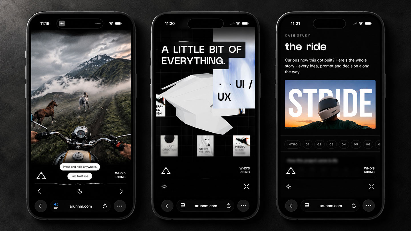
Responsive design did not mean shrinking the desktop experience. The mobile context required different decisions.
The original videos were horizontal. Cropping them to fill a mobile screen would remove too much information from both sides. The solution was to create separate mobile videos.
- Separate video composition and orientation
- Different navigation and menu mechanism
- Scroll removed, hold/swipe interaction added
- Custom bottom logo and navigation area
- Arrows for moving between scenes
- Dedicated mobile menu toward the bottom
- Helmet shadow/edge to reinforce the POV
The helmet detail is subtle. It represents the small portion of the helmet naturally visible from the rider's perspective.
Responsive does not always mean rearranging the same design. Sometimes the interaction itself needs to change.
Chapter 23
Organise the AI work.
One large AI conversation eventually becomes difficult to manage.
After multiple rounds of edits, context becomes too large. Version tracking becomes difficult. Previous decisions are harder to retrieve. Different tasks start competing for context. A change in one area can affect another.
The solution was to split the work into specialised AI engines. Context files such as skill.md and cloud.md were used to hold the rules and context for those engines. The result is closer to a small AI team than one giant conversation.
When the project becomes too large for one conversation, split the context by responsibility.
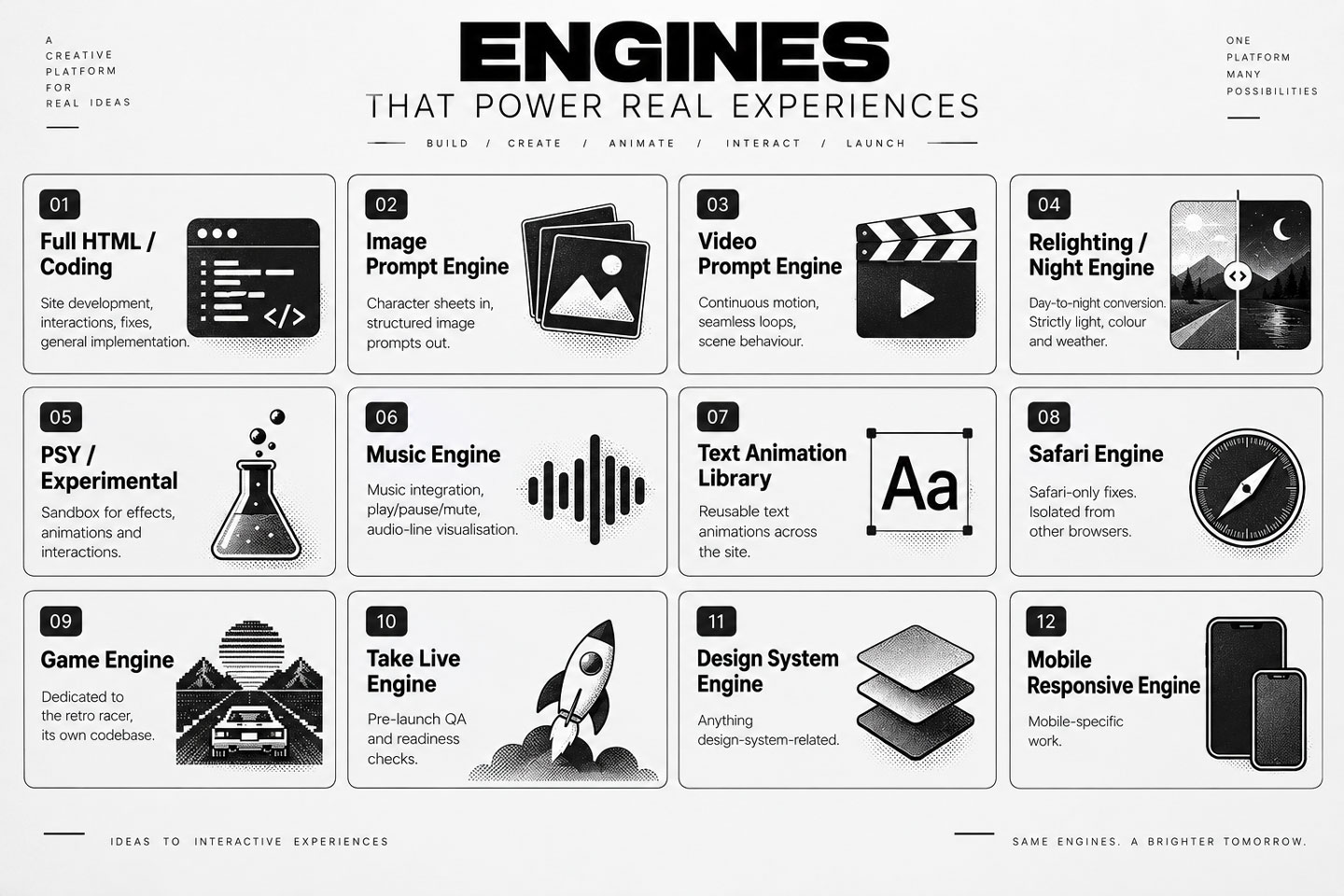
Deep dive See the twelve engines
- Full HTML / Coding - Site development, interactions, fixes, general implementation.
- Image Prompt Engine - Character sheets in, structured image prompts out.
- Video Prompt Engine - Continuous motion, seamless loops, scene behaviour.
- Relighting / Night Engine - Day-to-night conversion. Strictly light, colour and weather.
- PSY / Experimental - Sandbox for effects, animations and interactions.
- Music Engine - Music integration, play/pause/mute, audio-line visualisation.
- Text Animation Library - Reusable text animations across the site.
- Safari Engine - Safari-only fixes. Isolated from other browsers.
- Game Engine - Dedicated to the retro racer, its own codebase.
- Take Live Engine - Pre-launch QA and readiness checks.
- Design System Engine - Anything design-system-related.
- Mobile Responsive Engine - Mobile-specific work.
Plus the Chat Engine (Chapter 24) and the Behaviour Engine (Chapter 25).
Chapter 24
The Chat Engine.
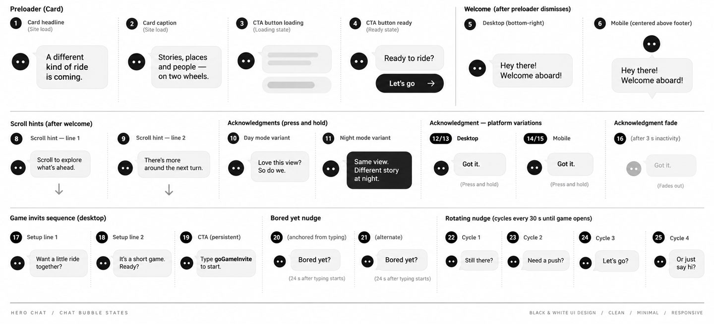
The chatbot is not a generic "ask me anything" interface. It acts as a conversational guide through the website.
The Chat Engine decides what should be said, where it should appear, when it should appear, which version should appear and how the message relates to the user's current state.
The conversation was mapped using platform, location, sequence and trigger.
User state → Trigger → Chat Engine → Contextual response → Next user action
Triggers include site load, ready state, preloader dismissal, first scroll, arrow or touch signal, first press-and-hold, inactivity, game opening or closing, iframe loading, previous interaction state, time elapsed and scroll state. The chat can respond differently depending on what the user has already done.
A good conversational interface is not just copy. It is a state system.
Chapter 25
The Behaviour Engine.
The Chat Engine decides what the site says. The Behaviour Engine defines how the experience behaves.
Every gesture, transition and interaction runs through this canon first. (Voice is a separate canon - see Chapter 03.)
Define the behaviour before wiring hundreds of interactions.
Deep dive See the behaviour rules
Behaviour
Chapter 26
The game: use a personal reference.
The game was not added because every portfolio needs a game.
It was added because a motorcycle game connected naturally to a childhood memory. Road Rash was part of the experience of growing up with early computers. That memory became a useful source for an unexpected interaction.
The game gives the website a break from the main ride. For younger users, the retro game can feel unexpected. For millennials who grew up with similar games, it can trigger recognition and nostalgia.
The purpose is simple: an unexpected break, a personal childhood connection, nostalgia, a playful interaction, an AI experiment. There is no need to invent a deeper professional metaphor.
A personal reference can become a strong interaction when it is used with restraint.
Chapter 27
Customise an existing foundation.
The game started from an existing open-source JavaScript racer.
Repository: github.com/jakesgordon/javascript-racer. It was downloaded directly from GitHub and placed in the project folder.
Claude was asked to understand the existing game, create a separate local environment, keep the game files isolated and apply the website's design system. The game was maintained in a separate folder and separate local environment.
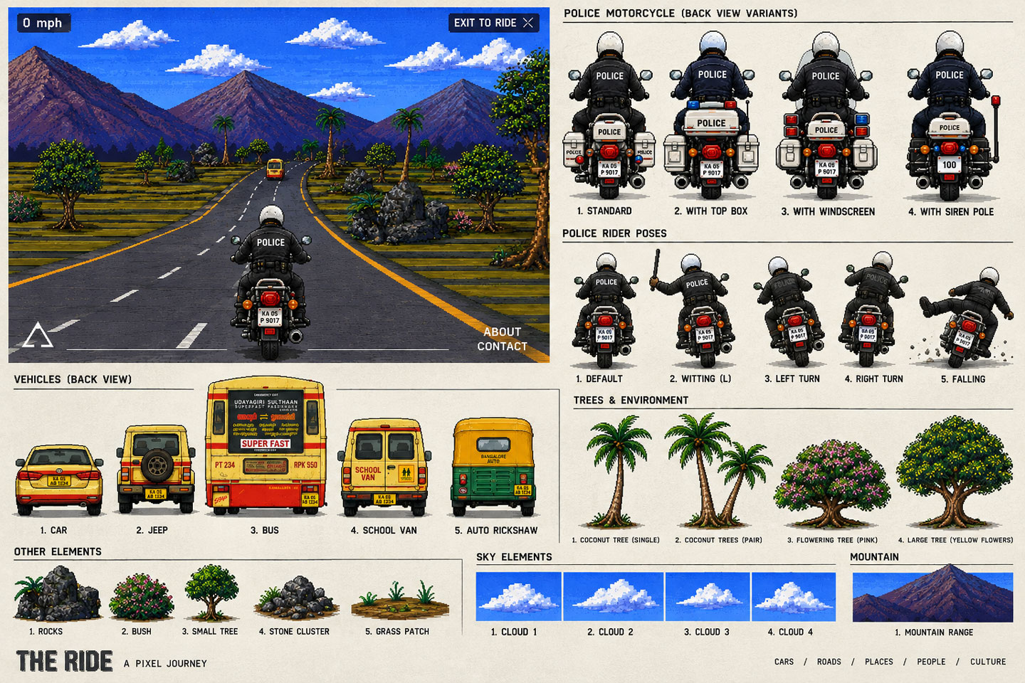
Then the visual and interaction layer was customised: characters, backgrounds, colours, visual assets, police appearance, rider standing posture, riding posture, collision, sound effects and other interactions.
The game became a useful example of AI-assisted modification. Start with an existing technical foundation. Understand it. Define what should change. Use AI to implement the changes. Test the result.
You don't always need to build the technical foundation from zero.
Chapter 28
Game as an AI experiment.
The game demonstrates another useful AI workflow.
The visual assets were generated with ChatGPT and edited in Photoshop. The existing game logic provided a foundation. Claude handled the coding and modification work.
The designer remained responsible for what should change, how it should look, how it should behave, and whether the result felt right.
This is a useful model for non-developers: use an existing technical base where possible. Use AI to understand and modify it. Use visual judgement to direct the result.
AI can help customise existing systems without requiring you to build every underlying system from scratch.
Chapter 29
Music and sound.
Sound was treated as part of the interaction rather than something that plays automatically.
Music and game sound effects were sourced from Envato. The website remains silent until the user enters the experience.
A dedicated Music Engine handled the implementation: music integration, play, pause, mute, playing animation, line/waveform-style visual feedback and music interaction behaviour.
Sound should respond to the experience. It should not fight for attention before the user is ready.
Chapter 30
Asset organisation.
Generated assets become much easier to maintain when they are organised around the experience rather than scattered across one folder.
For each scene, the video system contains four variants: Desktop WebM, Desktop MP4, Mobile WebM, Mobile MP4. One scene = four files. Organised into separate folders.
This makes replacement simple. If a scene needs a new video later, the relevant file can be replaced without restructuring the entire project.
Good asset organisation is part of the design system too.
Chapter 31
Tools are roles, not a logo wall.
The project used many tools, but the useful way to understand them is by role.
Creative AI


Design


Video & post


Audio & sourcing

Development


Game


3D & helmet demo


References


Chapter 32
The AI engine map.
The most useful way to show the AI workflow is not as a list of chatbots.
Show each engine as a specialist with responsibility, input, process, output and next step.
Specialised AI contexts make large projects easier to manage.
Deep dive See the engine specs
Prompt generation
- Input
- Rider sheet, motorcycle sheet, helmet sheet, place reference.
- Process
- Understand fixed visual characteristics. Translate them into a structured prompt. Keep POV and character details consistent.
- Output
- Image-generation prompt.
- Handoff
- ChatGPT generates the image.
Motion definition
- Input
- Final still image, desired motion, loop requirements.
- Process
- Describe continuous motion. Define what moves and what stays stable. Define the first-to-last-frame relationship.
- Output
- Video-generation prompt.
- Handoff
- Magnific + Seedance 2.0.
Day to night, structure preserved
- Input
- Existing day video, desired night treatment.
- Process
- Protect structure. Change lighting and weather only.
- Output
- Relighting prompt.
- Handoff
- Magnific + Seedance 2.0 + After Effects.
Browser-isolated fixes
- Input
- Safari-specific bug.
- Process
- Keep the fix isolated from other browsers.
- Output
- Safari-specific implementation.
Pre-launch readiness
- Input
- Complete project.
- Process
- Check code, SEO, links, database, chat, responsive behaviour, browsers and missing functionality.
- Output
- Pre-launch issue list and readiness state.
Chapter 33
Take Live Engine.
Before launch, the project went through a dedicated AI-assisted readiness check.
The Take Live Engine checks code quality, award-worthy site readiness, SEO in HTML, broken links, required functionality, database, chat, responsive behaviour, browser compatibility and anything that may have been missed.
Build → Check → Fix → Check again → Go live
The goal is not to ask AI to declare the site perfect. The goal is to create a repeatable checklist so important things are not forgotten.
A good launch process is a checklist, not a feeling.
Chapter 34
The complete visitor flow.
The main website experience follows a simple path.
-
Invitation.
The visitor lands on a preloader inviting them to come along for a ride.
-
Enter.
The visitor chooses "I'm in."
-
The ride starts.
A background video shows the rider moving. A black overlay appears. The conversational guide begins.
-
Explore.
The visitor moves through different scenes. The motorcycle POV continues. Each video loops continuously.
-
Night.
A long press reveals the night version. The same scene becomes a night version without rebuilding the composition.
-
Game.
The visitor can enter the retro motorcycle game. An unexpected break and an AI experiment.
-
Return.
The visitor can return from the game to the main ride.
Invitation → Ride → Explore → Day/Night → Game → Return
Chapter 35
Let analytics shape the next version.
The site doesn't stop being designed when it goes live. Once people start using it, their behaviour becomes another source of information.
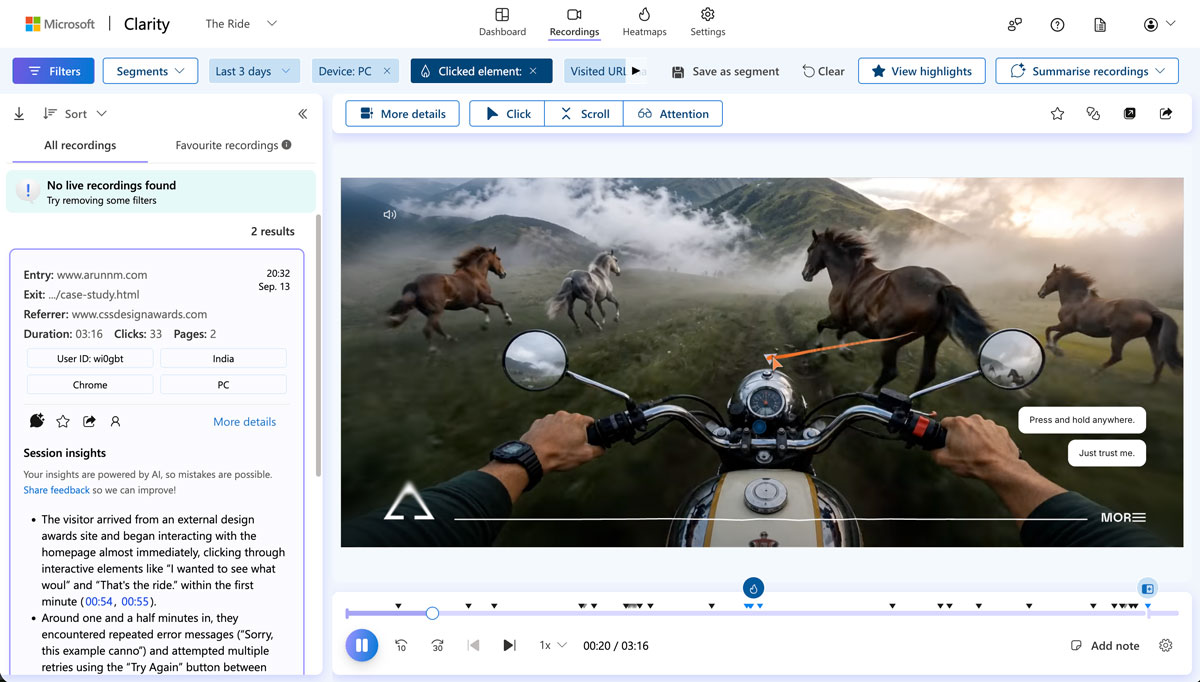
Google Analytics helps show what is happening across the site. Microsoft Clarity gets closer to how people are experiencing it through session recordings, heatmaps, scroll depth, rage clicks and dead clicks.

Google Analytics
Shows what is happening across the site - the pages visitors reach, the devices they use, where they arrive from and where they leave.

Microsoft Clarity
Shows how people are experiencing the site through session recordings, heatmaps, scroll depth, rage clicks and dead clicks.
-
Session recordings
-
Heatmaps
-
Scroll depth
-
Rage clicks
-
Dead clicks
Together, they help answer a simple question: what can be understood from the way people actually use the site?
Understand before you change.
Analytics is not there just to collect numbers.
It can show where visitors come from, which pages they visit, what devices they use and where they leave. Clarity adds another layer by showing what happens inside those visits.
The aim is not to optimise everything. It is to find something worth looking at, understand it properly, and decide whether it needs to change.
Let behaviour shape the next version.
The process is deliberately simple:
Watch → Notice → Hypothesise → Change → Measure again
A session recording might reveal an interaction being missed. A heatmap might show where attention is going. Analytics might reveal a page or device behaving differently than expected.
Instead of changing several things at once, one change can be made and measured again.
The point is to maintain a clear connection between what was observed, what was changed and what happened afterwards.
What I've changed so far.
This is where the actual analytics observations become part of the story. The examples should be based on things that were genuinely observed after launch.
Each example follows the same structure:
What I saw → What I changed → What happened next
Make night mode easier to discover.
What I saw
Users were completely missing the night version. The interaction was introduced through a chat bubble, but people started overlooking the message and never discovered that the experience could change.
What I changed
I introduced a small pill that follows the cursor and makes the night-mode interaction visible without relying on the chat bubble being noticed.
What happened next
Users started figuring out the night mode by clicking and holding. The interaction became easier to discover, and I started noticing that users were spending more time exploring the site.
Bring the menu into the open.
What I saw
The whole site was hiding behind one small link - MORE, tucked into the bottom-right corner. Analytics reports, heatmaps and session recordings all said the same thing: most visitors never opened it. They finished the ride and left without ever seeing the rider page, the case study or the game.
What I changed
I stopped hiding the menu. The MORE link and its full-screen overlay are gone. In their place is a plain horizontal menu at the top-right - The ride, Game, The rider, Build - always visible, nothing behind a click.
What happened next
People started clicking through. The pages that were being missed are getting found, and visitors are spending time in the parts of the site they never used to reach.
The first version of the site came from experimentation, testing and judgement. Now the people using it add another layer of information.
The process becomes:
Build. Launch. Observe. Learn. Change.
The site keeps evolving because the design process does too.
Chapter 36
The real lesson from the process.
The most important lesson is not which AI tool was used. It is the order of the thinking.
A useful sequence:
- Find something genuinely personal.
- Explore the concept before designing it.
- Give the concept a story.
- Give the story a behaviour.
- Identify what must stay consistent.
- Build references.
- Test the visual direction.
- Turn successful experiments into systems.
- Use AI for repeatable generation.
- Filter before expensive production.
- Build the design system.
- Implement page by page.
- Test locally.
- Isolate browser-specific problems.
- Split AI contexts as the project grows.
- Run a launch checklist.
The tools can change. The thinking sequence remains useful.
Final chapter
Start with the idea.
Don't start by building.
Technology will be available. AI tools will keep changing. New generation models will keep appearing. The harder part is deciding what is worth making.
Start with something unique to yourself. Give it a story. Give it a behaviour. Then look at the technology that can bring that idea to life.
The goal is not to use every new tool. The goal is to find the right combination of thinking, design, experimentation and technology for the experience you want to create.
If the idea is yours, the result will already have something a template cannot give it. AI can help build the bridge.
Find your idea. Give it a story. Give it a behaviour. Then build.

